I found a way to make both texts ("OCD" and "don't judge things you don't understand") stand out. On the "OCD" block letter print I used the layer blending mode Divide. And for the other text, I copied and pasted the text from the free font website but it copies the white background of the text with it so instead of using the magic wand tool to delete the white background, I used it to select the black letters and delete them leaving the white behind. I then used the soft light blending mode to make it translucent. I really like the effect because it's simple and makes the text stand out more than just the plain black text.
Friday, 6 December 2013
Wednesday, 4 December 2013
More poster experiments and trying to incorporate the techniques
I needed to try to incorporate the techniques from the workshops in week 1-3, so I scanned in the brusho mark making backgrounds that I did in Suzanne's session to put in the background of my posters.
I also tried block printing letters over photographs of my two models and I like how they turned out, although the one that reads "not every disability is visible" could be improved as the letters are too big so the D is covering her eye. I scanned these in and cut the words out with photoshop and copied them on to my posters after image tracing them on illustrator. I really like this technique and will definitely develop it.
And the third technique that I experimented with was continuous line drawing. I printed out a photo of each model and drew on the top of that photo a continuous line drawing which I think worked quite well, I may carry on experimenting with it and see how that goes. I also did a continuous line drawing of each model on plain paper to scan in and put over the photo digitally on photoshop. I don't think this worked as well. I played around with moving the line drawing off the face to show that there's another side to the person. I liked the effect after using the image trace on illustrator with this too. I also really like the font used in that poster.
In the background of this poster I jumbled up the letters of the word "dyslexia" in the background of the image to portray how a dyslexic may see it.
I played around with adding text to give the image a purpose (to raise awareness of dyslexia and stop discrimination) but I didn't like the compositions no matter what I did. This is something I will need to experiment with.
I also like how I changed the blending mode of the block printing to overlay as it doesn't distract too much from the text at the bottom.
Tuesday, 3 December 2013
Talk with Anne-Lise
I had a chat with one of my tutors, Anne-Lise, and she said that she wasn't keen on the text/font on my last few posters. She showed me a way of copying the fonts to photoshop from a free font website which is really useful. We found a font that we both like and I am going to have a play round with it to see what works best.
She also showed me how to do an image trace on illustrator again (like we did on the post cards in the first session with her in this module) and I really liked how it looked over the photo. She also suggested to not put the line drawing directly over the photo and to put it to the side because it sort of suggests that there's another side to that person.
Monday, 2 December 2013
Developing Posters
I really like the multicoloured effect of two of the words as it emphasises the message to not judge disabilities because we don't understand. I think the black text works better than the green text as it is easier to read. In the last poster, I made the background a lot lighter which gives it a cleaner look making it more effective.
Posters
I really like how these posters turned out and I will definitely develop the idea. I think I prefer the photo in the first one due to the composition and the lighting, although I do like the lighting in the second poster, the bright light made her squint so gave a less natural looking image.
I prefer the landscape format of the second poster as I could position the text how I wanted and I feel like this, along with the font and the overlayed repeated word "Dyslexia" works really well.
Thursday, 28 November 2013
Photo Shoot
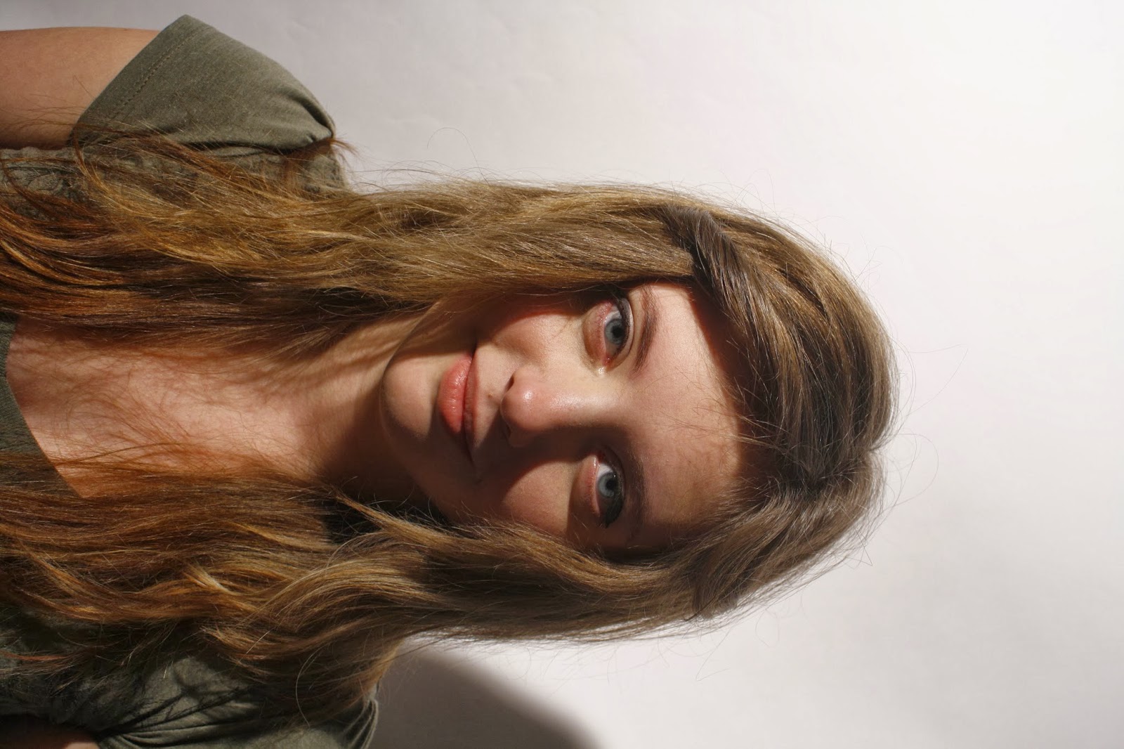
These are my favourite images from the shoot due to the composition and lighting. I really enjoyed the photo shoot as it was really fun and a good experience.
Subscribe to:
Posts (Atom)