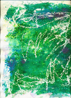
I needed to try to incorporate the techniques from the workshops in week 1-3, so I scanned in the brusho mark making backgrounds that I did in Suzanne's session to put in the background of my posters.
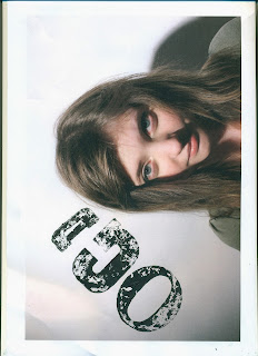
I also tried block printing letters over photographs of my two models and I like how they turned out, although the one that reads "not every disability is visible" could be improved as the letters are too big so the D is covering her eye. I scanned these in and cut the words out with photoshop and copied them on to my posters after image tracing them on illustrator. I really like this technique and will definitely develop it.
And the third technique that I experimented with was continuous line drawing. I printed out a photo of each model and drew on the top of that photo a continuous line drawing which I think worked quite well, I may carry on experimenting with it and see how that goes. I also did a continuous line drawing of each model on plain paper to scan in and put over the photo digitally on photoshop. I don't think this worked as well. I played around with moving the line drawing off the face to show that there's another side to the person. I liked the effect after using the image trace on illustrator with this too. I also really like the font used in that poster.
In the background of this poster I jumbled up the letters of the word "dyslexia" in the background of the image to portray how a dyslexic may see it.
I played around with adding text to give the image a purpose (to raise awareness of dyslexia and stop discrimination) but I didn't like the compositions no matter what I did. This is something I will need to experiment with.
I also like how I changed the blending mode of the block printing to overlay as it doesn't distract too much from the text at the bottom.


No comments:
Post a Comment