I really enjoyed this 3D lesson, especially making the beads... We also made a bowl out of shredded magazines and paper which I enjoyed too as mine was colourful :)
I would like to create more beads and create jewellery out of them as they would sell quite easily on markets as they're handmade and made from recycled paper so they're environmentally friendly... They do, however, take a long time to make but I'm sure that the more you practise the faster you get. I don't think I will do this for my project though...
Monday, 30 September 2013
Friday, 27 September 2013
Nick Gentry Analysis

Analogue Daydream
Film negatives, x-rays
and oil paint on acrylic sheets in vintage wooden LED lightbox crate
60cm x 40cm
60cm x 40cm
Here, the artist has stuck some film negatives and x-rays
onto acrylic sheets on a wooden LED lightbox crate, blocked out the background
of the person with white paint and shaded parts of the face such as the
highlights and shadows with oil paint. Again, like with the colours of the
floppy discs, he has used the light and dark bits and the colours to add depth
and colour to the portrait. He has used the dark shades in the x-rays for her
dark hair.
Compared to Midnight
Angel and his other paintings on floppy discs, this painting is very warm
toned and a lot less eerie and creepy, but equally as effective.
All of these elements create another very unique, interesting,
3D and realistic looking painting which very effectively uses recycled
materials and therefore fits very well with the theme of Trash to Treasure.

Midnight Angel
Oil paint & used
computer disks on wood
113cm x 90cm
113cm x 90cm
Gentry has stuck some recycled floppy disks from computers
onto a background of wood and has lined them up so they are all facing the same
way apart from the two near the eyes and has used the circular part of the
floppy disc as the pupils. In his other pieces, he has done this for the whole
eye because the works have been smaller, I find this bigger one less creepy
than the smaller ones as the bigger ones only have a circle for the eye.
He has then drew on the outline of the person and painted
the space behind the model to accentuate the portrait. He has very effectively
used the colours of the different floppy discs to colour and add depth to the
face and used oil paint to shade in areas of the face, highlight areas and also
add a small bit of colour to the lips, creating a very 3D realistic and unique
painting.
Overall, the image is very cold and slightly eerie, but I
really like the effect of it as it is unique and uses the ideas of Trash to
Treasure really well.
Inspiration... Nick Gentry
Nick Gentry

Oil paint and used computer discs on wood

Oil paint and used computer discs on wood

Vintage film negatives and xrays with oil paint on acrylic sheets

Vintage film negatives and xrays with oil paint on acrylic sheets
I really like the idea of painting onto a background of recycled, flat objects, and love what Gentry has done with the used, recycled floppy discs and also the old films and xrays. I think I could do something quite similar inspired by him, but experiment with backgrounds of collage and mixed media, integrating the techniques I have learnt from Suzanne in textiles... Do a painting on Tyvek or Lutradur and burn holes in it and distort it... The only problem I have is what I would paint...

Oil paint and used computer discs on wood

Oil paint and used computer discs on wood

Vintage film negatives and xrays with oil paint on acrylic sheets

Vintage film negatives and xrays with oil paint on acrylic sheets
I really like the idea of painting onto a background of recycled, flat objects, and love what Gentry has done with the used, recycled floppy discs and also the old films and xrays. I think I could do something quite similar inspired by him, but experiment with backgrounds of collage and mixed media, integrating the techniques I have learnt from Suzanne in textiles... Do a painting on Tyvek or Lutradur and burn holes in it and distort it... The only problem I have is what I would paint...
Thursday, 26 September 2013
Developing the Recycle Posters...

I'm not too keen on this first one (above) because it's a bit plain and boring, and I don't like the washing line thing but I was just experimenting...

I developed this second one by changing the font of the text, I like this font better.

I then added the poster edges effect to the main image and did the same to the small images of litter.

Then I kept the small images as the poster edges filter, but changed the main image back to the cutout effect again. I felt as though this worked better but still didn't like it but I couldn't figure out why...

I zoomed in to the background image to focus on one part of the image as this is my favourite part of the image because the people walking across the road makes it look more interesting. I also kept the cutout effect on the background image and the poster edges effect on the small images. After I zoomed in I started to like it better...

I decided to get rid of the washing line thing across the top and the small images of litter and focus on the main image and the text. I liked it better than the other designs because it's simple and effective, but the brief requires me to put images of litter on it...


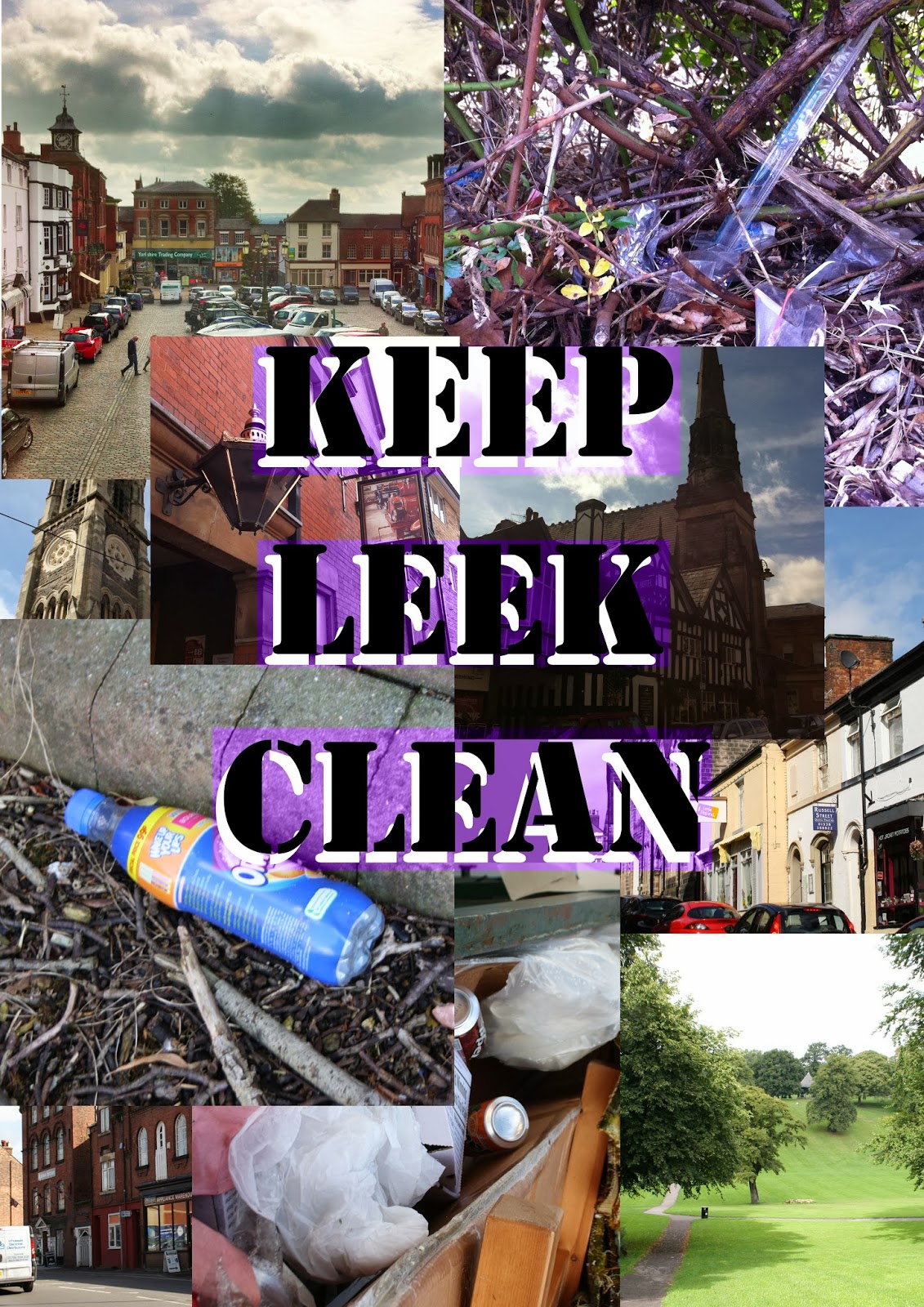
So that's what I did for these last two, I played around with the composition of the images of the litter and the blending modes of the layers and settled on this one for the final design. I like this one because the emphasis is still on the main background image and looks like a "grungy" picture of Leek, but then if you look carefully you can see images of litter blended into it.
Wednesday, 25 September 2013
Life drawing
Starting to quite enjoy life drawing!


I think after the break I need to work on the head and the legs and accentuate the highlights more. Will post another few pictures after!
Tuesday, 24 September 2013
Recycle Posters
Only 5 of the photos are mine because I had problems uploading the images to the computer from my phone, the rest are someone else's.

These two (above and below) are my favourite as the composition is nice and neat... I can't decide which of the two would be my absolute favourite... If I had to choose I think it would be the one below as I'm not keen on the purple on the top one and I prefer the faded pictures as the writing stands out more.

I'm not too sure on this one (above)... I was just trying to change the composition around a bit but ended up not liking it as there is no real structure to it.

I like this poster as the main picture of one of the most well known parts of Leek, the Market Place, and then has the three images of rubbish at the bottom. These three pictures of rubbish contrast with the really pretty Market Place.


Monday, 23 September 2013
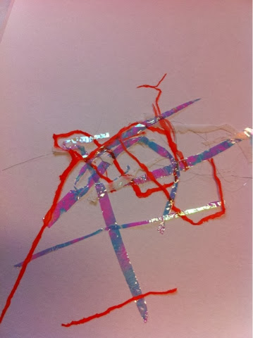
3D: Recyclable plastics
I much prefered working with plastics compared to working with the metals last week as it was a little more familiar. I enjoyed melting crisp packets and plastic bottles, and, my favourite technique was polymorph because I could manipulate it exactly how I wanted to. However, I'm not sure that I could use any of these techniques in my project. I could use the plastics to create a picture like Sheila Gallagher...

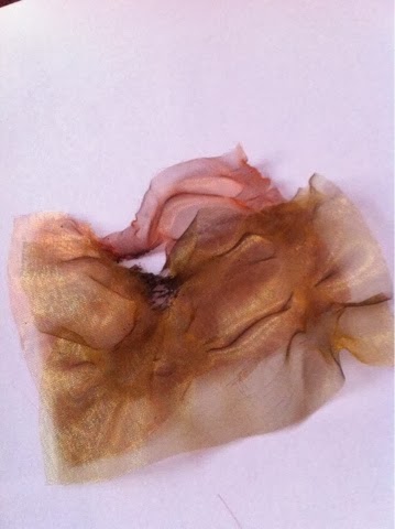
Organza, Lutradur and Tyvek

Netting

Lutradur

Tyvek
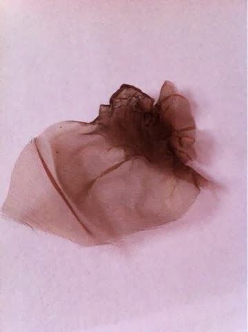
Organza

Netting
Two colours of organza heated together

Lutradur, netting, organza and stitch


Netting, organza, lutradur, ink and stitch
I really enjoyed this session and really like the last sample I made with the blue ink, lutradur, organza, netting and stitch because the layers really make it interesting. I think it looks like one of my images from Les Oakes...

I could paint something on the lutrador and burn holes through it...
Thursday, 19 September 2013
Professional Practise for Employability Session 2
- Gift bags
- Labels
- Tote bags "Merry Christmas"
- Tote bags with illustrations on
- Tote bags with personalised "Pip and Pepper" characters
- iPhone cases
- Greeting cards
- Tree decorations
- Bunting
- Clear bauball with sprinkles/ glitter/ coloured paper inside
Plain tote bags - £1.30 each on ebay
Add value by- Silk screen or stitch.
Sell for £8 each
Profit -
Plain iPhone cases - 99p each on ebay
Add value by - decorating with diamontes, beads and buttons, or handpaint.
£3 for decorating materials
Sell for £12 each
Profit - £8.01
Plain clear baubles - £1.75 each on ebay
Add value by - putting glitter/ sprinkles/ coloured paper inside/ hole punched paper
£1.44 for 20g of craft glitter,
Plain chrome bottle tops - £5.50 for 20 on ebay, or free from Beth's work...
Wednesday, 18 September 2013
Life Drawing Session 1 and 2
I found the first session really awkward as it was my first time drawing a naked person... I didn't really know where to look! I did two 20 minute drawings in pencil and graphite stick and 4 small one minute studies. The one minute studies weren't brilliant but it was supposed to loosen me up and it did. I like the two 20 minute studies as the proportions and the detail was good.
I felt a lot less awkward and more confident for the second session and really enjoyed working with charcoal and chalk. The last 20 minute drawing I did was a sitting pose in charcoal and chalk on black paper. I was really impressed with it as I got the proportions and foreshortening right my tutor said.
I felt a lot less awkward and more confident for the second session and really enjoyed working with charcoal and chalk. The last 20 minute drawing I did was a sitting pose in charcoal and chalk on black paper. I was really impressed with it as I got the proportions and foreshortening right my tutor said.
Tuesday, 17 September 2013
Creating Surface Pattern Designs

I like this one (above) but I think it is a bit boring... I prefer the next two...

These two (above and below) are my favourite pattern designs because of the colours and the transparency of the motif... I also like the two different sizes of the motif as it is more interesting than just the same size motif.


(Above) I'm not too sure about this one, I like the background and the motif separately but I think that the combination isn't that great as the motif is sort of lost in the background as they are both fairly detailed elements.
Monday, 16 September 2013
Plastic Heat Bonding, Thread and Glue, Angelina Fibres, Wax Trapping and Mixed Media
I really enjoyed this session as I really liked all the textures I created. I could:


- use the techniques to make a background to paint on
- create an image from the techniques


Subscribe to:
Comments (Atom)