Monday, 19 May 2014

Text on the Poster Edges Acetate

The white transparent text on the poster edges works really well over the darker parts of the image but not so well on the coloured parts

 photo B240E243-989D-4330-B61A-A00F1F939A35_zpsc0edqiqq.jpg

 photo 33802C82-DCCC-403B-B951-0C23F82A0931_zpsmkx3mcj9.jpg


So I tried putting the text in one of the darker areas and it looked much better

 photo F1577EE0-1048-4003-A367-4DA1B3F0EED1_zpsredvjnet.jpg

 photo 605DDB87-FA06-4E1A-A273-0F64FB90E82B_zpsdshiag1c.jpg

 photo 83418EAD-20F4-4E91-8939-7EA676CBFD90_zps9eywdbyx.jpg

Friday, 16 May 2014

Writing in the Image

My tutor suggested that I put the text in the black image on Photoshop inspired by this image:


http://www.clker.com/clipart-sherlock-holmes-silouette-with-text.html


 photo 5A8089E8-171B-4046-872E-8242A2F99539_zpsiaslrmdt.jpg

 photo 1BE5F3AE-5F92-48D0-8C41-794D3B0D933C_zpsetr0vwbr.jpg

 photo 35D627FF-129F-4BED-9FBC-C5B46551529F_zpsmfadzhvh.jpg

 photo 8D11386E-555F-43F0-BED7-03211BDB2FC3_zpssbwnqw54.jpg

I think these work really well, I will continue to experiment with this technique as you can read the text clearly. I think it will be interesting to see how it looks with the poster edges effect.

Poster Edges

I did an experiment without text in the background to determine which effect on acetate works the best over the background image. A colour one, a poster edges with more green added on variations, and just a plain poster edges. I think that the middle one, the poster edges with more green, works the best, the plain poster edges is just too plain, dark and dull.

 photo 7E8A0443-7CD6-4EF8-BA75-DA681E725DA1_zpssm6ivg0v.jpg

Thursday, 15 May 2014

Colour Acetate

Along with the experiments for colour acetate, I experimented with a different way to incorporate text, by writing on the background image. I prefer the printed text, but will try to find a better way for the viewer to read all the text.

 photo D5B72DC5-E892-4225-81DA-D27DF32C3E03_zpsqcfehtov.jpg


While I like the second one of the road in Butterton Moor, the first one is not very visible and is worse than the all black acetate sample. I will try to add the poster edges effect on Photoshop to get the bold black lines but also some colour to be able to see what the image is.

 photo B58F69D7-EE71-431B-A010-F54C529F14DE_zpsbsgdihog.jpg

 photo 31C0E488-FCEB-465E-8E47-E0CFFA80BC3F_zps5vemnlzu.jpg

Wednesday, 14 May 2014

More Acetate Experiments

After the Lud's Church acetate experiment, I tried more examples and really liked them. I think I prefer the bottom one because the image is more monochrome with clear tissue paper instead of dress makers paper, with green paint and bold text in the background. I just think it is more impactful so I will continue to experiment with this kind of colour scheme.

 photo 11B0EA3D-CDD9-4A88-99F3-D8675720B75B_zpsitoum525.jpg

 photo 07E73F71-C84C-46F7-85C0-1E6A8E468FD1_zpsmgmauhj8.jpg

Also, I got feedback from someone who said that you can't really tell what the image on the acetate is so I will try changing the colours on the acetate.

Tuesday, 13 May 2014

Variations

I experimented in Photoshop with some layer blending modes and layering, hue and saturation, and levels to create these variations...

Here is the original:


Variations:


I think they all work really well, I will have to try doing it with other photos from the other locations to see what it looks like with all of them. I think I still prefer the actual, physical, original version of the image. Also, I would like to try to incorporate some more photos to link it in with my photography.

Getting somewhere!

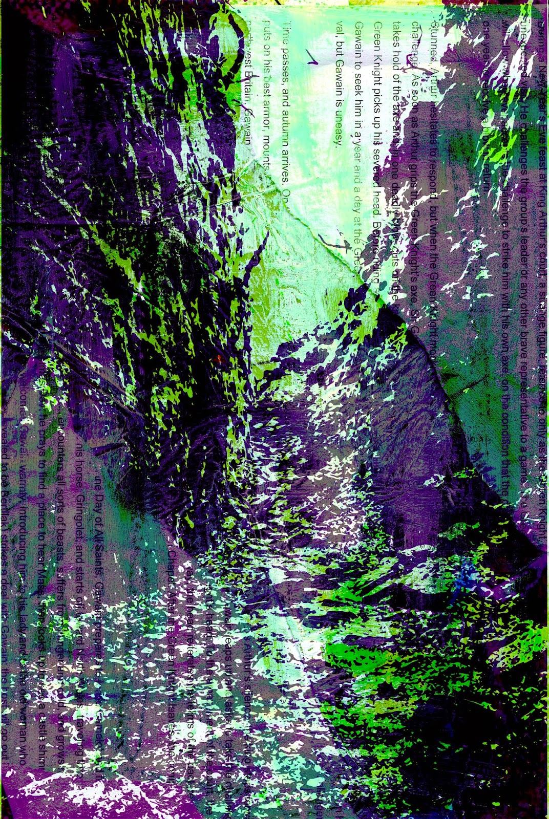
Today, I have tried a new technique - collage with printing on acetate over the top. I think it works really well and that it's a very good way for me to integrate the text into the images about the stories and folklores in the locations.


 I started out doing the background, oil pastel, images, dressmakers paper, acrylic, white emulsion, wax entrap, text.

Here is the scanned in image:


Then I printed out the Lud's Church image trace off Illustrator onto acetate and layered it on top. Here is the image trace on top of the scanned image of the collage background:


I think these turned out really well and will definitely experiment more with the technique. I will also rewrite the stories so that I'm not just copying and pasting into my own work, I will only do that for experiments, not for my actual book.

Also, I'm not sure whether or not I should publish the book or make a sketchbook with the images in, because I think the techniques and the text will be a bit lost in my published book, it would be more clear in the sketchbook/handmade book.