When I first started drafting out ideas for my Final Major Project, my idea was to create a calendar using photos of key elements from towns in Staffordshire Moorlands and the surrounding area. While this was a nice idea and a way for me to practice new skills in the area of landscape photography, it was brought to my attention during a group crit with Gwen, that this idea would need to have something that made it different. I realised that they were right and that it would be boring and just like any other calendar. So then, while listening to others talk about their ideas for their projects, I was inspired by what they were saying to take photos of areas in Staffordshire and the surrounding area that had a legend or a story attached to them, for example the Mermaid Pool. I decided to create a book with a photo of each place and some text to tell the story.
Originally, I envisioned a published book (through vistaprint or blurb) with a good quality photograph and some text on the adjacent page, or an illustration. However, I came to the realisation that I want to do fine art rather than photography as a career and after this course, so I started experimenting and trying to find ways to combine the two. What also helped confirm this realisation, was when I seeked out feedback on my plain, unedited photos on talkphotography.com - the comments put me down and made me realise that I am making the right choice with choosing fine art.
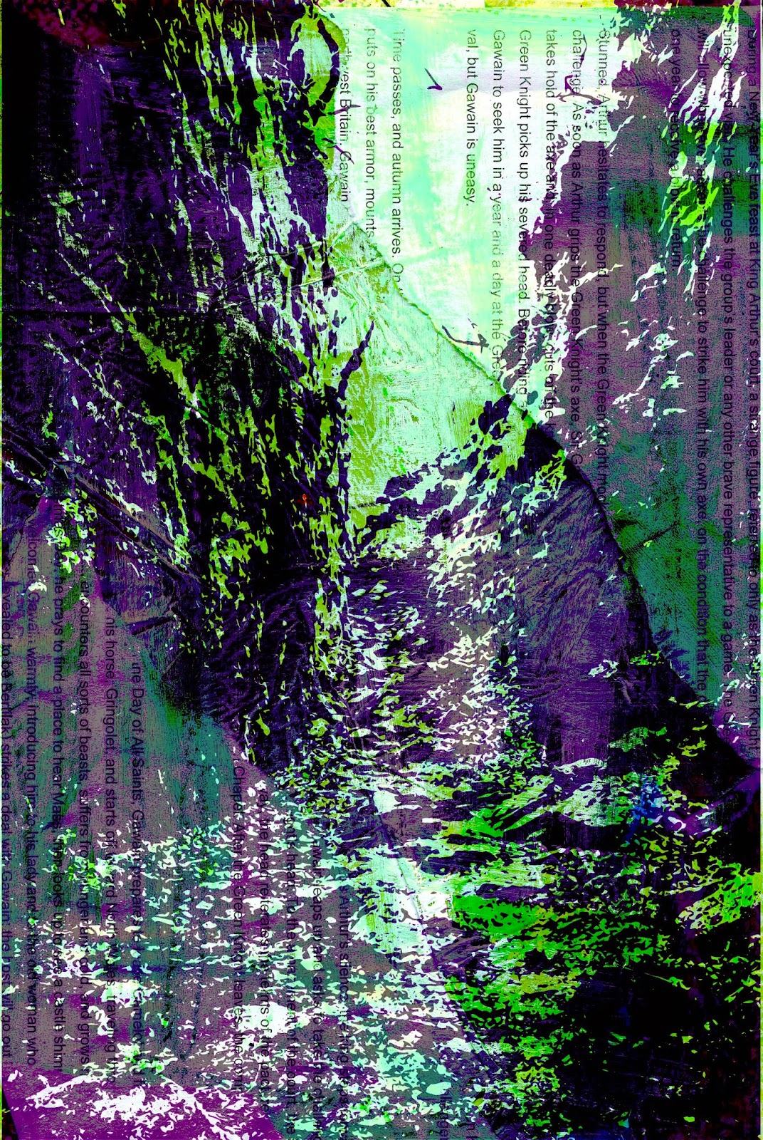
While experimenting with trying to tell the story just using pictures, I tried printing on acetate and layered it over a collage with the text from the story. This worked really well I thought, so I developed this technique further and did a couple more smaller samples. I got feedback on the samples and was told that you can't really tell what the image on the acetate is of as it is all black (because I used image trace on Illustrator). So I then experimented with putting colour onto the otherwise black images. It didn't work brilliantly so I added a bit more black in, experimented with the cutout effect on Photoshop and the poster edges effect, and found that the poster edges effect worked the best.
A college tutor suggested that I put the text inside the black image so you can see through the writing. this was very effective so I realised that if I combine the poster edges effect with the transparent text, I would have really effective images. I tried it and it worked very well and realised that this is what I'll be doing for my final piece and also, that if I scan the collage and acetate in to publish, the detail will all be lost so I will put them in a physical book, or bind a book myself.
Friday, 23 May 2014


Thursday, 22 May 2014
Staples
I decided to print my book with Staples because I would like to display my originals at the exhibition. I designed the layouts and the front and back covers on Adobe InDesign and printed them out on A3. I will trim them down and bind the pages myself.
Book binding...
http://www.wikihow.com/Bind-a-Book
I found instructions on how to bind my own book, but I'm thinking of just buying a sketchbook and use that to put my final pieces in...
I found instructions on how to bind my own book, but I'm thinking of just buying a sketchbook and use that to put my final pieces in...
Wednesday, 21 May 2014
Journal: Reflect on Exploratory and Pathway Stages in Relation to the FMP
In my Final Major Project, I have revisited many of the techniques from the Exploratory and Pathway stages such as emulsion and tape transfer, collage, wax trapping and Photoshop layering techniques. I have further developed the collage, wax and Photoshop techniques because I felt as though they lend themselves very well to my project of stories from the Staffordshire Moorlands and the surrounding area as they allow me to tell the stories effectively. In addition, I have tried layering and collaging with new techniques such as printing on acetate which I also find works very well.
The collage images...
I decided to try to add a map into the background and a title on each one, I tried it on the Butterton Moor image first (Headless Horseman) and thought it was very effective and would make the collage underneath the acetate more interesting. So I did the sane with all my other chosen background images and also made the saturation lower so that the bright colours on the acetate stood out more.


Tuesday, 20 May 2014
Developing Ideas
Developing from my previous experiments, I produced some pieces that i have used the cutout and poster edges effect on, made them more colourful, and added white and black bits as well as the white text to get some bits transparent. (I added the cutout effect on Photoshop before the poster edges effect to make it even more posterised and simple.) I think the transparent parts work really well as you can see the collage underneath the acetate more clearly and it is more effective.


I think that when I do my final pieces, I will think more about where I'm putting the white bits and the collage underneath.
I think that when I do my final pieces, I will think more about where I'm putting the white bits and the collage underneath.
Monday, 19 May 2014
Text on the Poster Edges Acetate
The white transparent text on the poster edges works really well over the darker parts of the image but not so well on the coloured parts


So I tried putting the text in one of the darker areas and it looked much better


So I tried putting the text in one of the darker areas and it looked much better
Friday, 16 May 2014
Writing in the Image
My tutor suggested that I put the text in the black image on Photoshop inspired by this image:

http://www.clker.com/clipart-sherlock-holmes-silouette-with-text.html


I think these work really well, I will continue to experiment with this technique as you can read the text clearly. I think it will be interesting to see how it looks with the poster edges effect.
http://www.clker.com/clipart-sherlock-holmes-silouette-with-text.html
I think these work really well, I will continue to experiment with this technique as you can read the text clearly. I think it will be interesting to see how it looks with the poster edges effect.
Poster Edges
I did an experiment without text in the background to determine which effect on acetate works the best over the background image. A colour one, a poster edges with more green added on variations, and just a plain poster edges. I think that the middle one, the poster edges with more green, works the best, the plain poster edges is just too plain, dark and dull.

Thursday, 15 May 2014
Colour Acetate
Along with the experiments for colour acetate, I experimented with a different way to incorporate text, by writing on the background image. I prefer the printed text, but will try to find a better way for the viewer to read all the text.

While I like the second one of the road in Butterton Moor, the first one is not very visible and is worse than the all black acetate sample. I will try to add the poster edges effect on Photoshop to get the bold black lines but also some colour to be able to see what the image is.


While I like the second one of the road in Butterton Moor, the first one is not very visible and is worse than the all black acetate sample. I will try to add the poster edges effect on Photoshop to get the bold black lines but also some colour to be able to see what the image is.
Wednesday, 14 May 2014
More Acetate Experiments
After the Lud's Church acetate experiment, I tried more examples and really liked them. I think I prefer the bottom one because the image is more monochrome with clear tissue paper instead of dress makers paper, with green paint and bold text in the background. I just think it is more impactful so I will continue to experiment with this kind of colour scheme.


Also, I got feedback from someone who said that you can't really tell what the image on the acetate is so I will try changing the colours on the acetate.
Also, I got feedback from someone who said that you can't really tell what the image on the acetate is so I will try changing the colours on the acetate.
Tuesday, 13 May 2014
Variations
I experimented in Photoshop with some layer blending modes and layering, hue and saturation, and levels to create these variations...
Here is the original:

Variations:


I think they all work really well, I will have to try doing it with other photos from the other locations to see what it looks like with all of them. I think I still prefer the actual, physical, original version of the image. Also, I would like to try to incorporate some more photos to link it in with my photography.
Getting somewhere!
Today, I have tried a new technique - collage with printing on acetate over the top. I think it works really well and that it's a very good way for me to integrate the text into the images about the stories and folklores in the locations.
I started out doing the background, oil pastel, images, dressmakers paper, acrylic, white emulsion, wax entrap, text.
Here is the scanned in image:


Here is the scanned in image:
Then I printed out the Lud's Church image trace off Illustrator onto acetate and layered it on top. Here is the image trace on top of the scanned image of the collage background:
I think these turned out really well and will definitely experiment more with the technique. I will also rewrite the stories so that I'm not just copying and pasting into my own work, I will only do that for experiments, not for my actual book.
Also, I'm not sure whether or not I should publish the book or make a sketchbook with the images in, because I think the techniques and the text will be a bit lost in my published book, it would be more clear in the sketchbook/handmade book.
Monday, 12 May 2014
Talk Photography - Feedback
http://www.talkphotography.co.uk/threads/critique-a-few-photos-for-my-college-project-part-1.540191/
Also, any ideas for editing in Photoshop to make them look eerie/creepy/atmospheric would be greatly appreciated.
")
There will be a second thread with more photos in if you would take your time to look at those too
Thanks,
Kirstin


skiwhiz: Hi as no one has commented I will give you some feedback, first to help people comment you need to post what the brief or project is covering, is it to shoot something that is eerie or atmospheric? that way the feedback will be focused on the task and peoples views as to whether it was achieved and if so how well you did.
In shot 3 the roadworks cone is distracting, did you mean for it to be there, if not crop it out. The light is not good with the exception of 4 and appears flat, which can help create an eerie shot, but as the photo's don't have a real point of interest that hits you, its hard to comment. If it was something spooky you were shooting, it may have been on 3 you got up close and shot the windows of the cabin to highlight the cobwebs and neglect. Try to play with angles and shoot something that is not at waist or head height.hope this helps a little.
sbowler579: Well Kirstin very difficult to crit is this set. Firstly there is very little focal point of anything of interest, particularly in the first image. I am not sure what you were wanting to capture there. I don't think you could improve the first shot. You say you want to make them, eerie creepy and atmospheric, but they would still lack an interesting element to the shots. May be a revisit on a misty foggy morning and with a figure or strong silhouette in shot would help.
The second shot with the figure in makes me ask what he is doing/upto. But am not sure how you could make it more errie, maybe convert to black and white. The third image again is uninteresting and the traffic cone needs cloning out. The last is the best of the set and the seat works well and is composed within the frame nicely, just needed a more interesting sky, maybe re shoot at sunrise sunset.
pjm1: I might not be best placed to critique other peoples' photos as I'm a novice, but I don't really do "rules", so here goes...
I have a habit of seeing something which looks nice and taking a photo. In these cases, I'm just trying to capture what I've seen without there really being a story behind it. More often than not, these are my worst shots - they lack "something" but I can never quite put my finger on it. Your first photo reminds me of those shots of mine in this regard.
Then again, sometimes I'm taking a photo which has some emotion behind it. It might be a photo of one of my children, or of a landscape that really reflects how I'm feeling... the point being there is something in the photo which communicates that emotion. Portraits are easier in this sense because you have eyes, landscapes are trickier for me, but can still convey eeriness, wonder, desolation, busy-ness or other feelings. When the viewer is able to pick up on the emotion which made you want to take the photo, you have a keeper. A beautiful sunset can be a great photo because it makes the view go "wow" in the same way the photographer did when he/she saw it. But there needs to be communication.
I like the fifth (edit: can't count!) photo because it speaks to me of a story which hasn't been told. It is missing something - a person who was there? Why is there a bench there at all? I think something added to that picture and shot at a different time could be brilliant. If you wanted to go sombre, a bouquet of flowers sitting on the bench, shot in the golden hours would be very interesting.
Just my 2p!
shruggy63: Would I be right in guessing that these images are part of a photo-story? A sort of murder in the woods thing?
First thing I'd do in Photoshop for each pic would be Image/Adjustments/Auto Levels from the drop down menus. I can think of some ways to make the pics more eerie but I'd need to know what your initial aim with the shots was?
Dunstan: The images all look a flat on my screen and need levels or curves adjustment to give some punch.
Jayst84: I think that flatish light is good if you're wanting 'spooky'.
What I would say is, really think about what you want from the photo. Why are you taking it? What is in the frame, and why is it in the frame?
There could be a reason for that pole in the first image I suppose, but I'm sure the traffic cone shouldn't be in either of those other images.
Had a very quick play in Photoshop with a couple. The desolate bench shot you could work with; could be a start / end of a story I think. And the trees - perhaps you could make something of that little light well in the middle leading into the unknown.
Would be good to know the story you're going for, then we can see the aim of the images. Most of the work should be done at (and before) the taking stage though, don't worry too much about post production yet.
![[IMG]](https://lh3.googleusercontent.com/blogger_img_proxy/AEn0k_t0OhL4eSkafCpJLTO-800p50EU84BMwR71oB0P-92Zj-yZ9lRutsva7cF9w3DGM4nUmqemDj-hQtxcbxylLZUYd0IvvSrZ-9szNpD0oURkg9YpMm92ziJgzDa-mMnRGJpX7xN-48juJL6LyRR6vPAh4ynQWIyslZ6LJDKVL8FfuYmhKYzs8Sg=s0-d)
![[IMG]](https://lh3.googleusercontent.com/blogger_img_proxy/AEn0k_uwgssPLt688Q4rHu59bxFLAmO36_5GxKByuIgrZH0J7dyKPjyLACiU4jRKxhpTdnBoY3NMoUJOeVzwIQtetriZ8NvfZ6vPp1t0X_5NDC9wPtLH4bxH9FqskTZVEQ-ltjidjHctSL4bfyoE4UHFh48nScUJbXVXxcwixlJicVpyaH7rCZntZyKu=s0-d)
Reflection...
I know I asked for peoples' honest opinions but I didn't realise that my images were THAT bad. I really tried with the composition and to make the best of the lighting and to use the right settings on my camera so it was very disheartening to read what these people have said. I think I will try posting some of my newer stuff on the forum, my edited stuff, although I'm not quite sure my mixed media/arty photography techniques would be appreciated here. I think I did mention that these photos were UNEDITED, I just wanted peoples' opinions on the compositions and stuff. Actually I did get that...
I feel like this has knocked me down a bit and made me feel like I'm no good at photography. I KNEW I should have stuck to painting. I'm feeling really negative about the whole project now and that I won't achieve my target grade. I feel lost and I don't know where I'm going with the project.
Subscribe to:
Comments (Atom)